Context
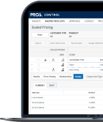
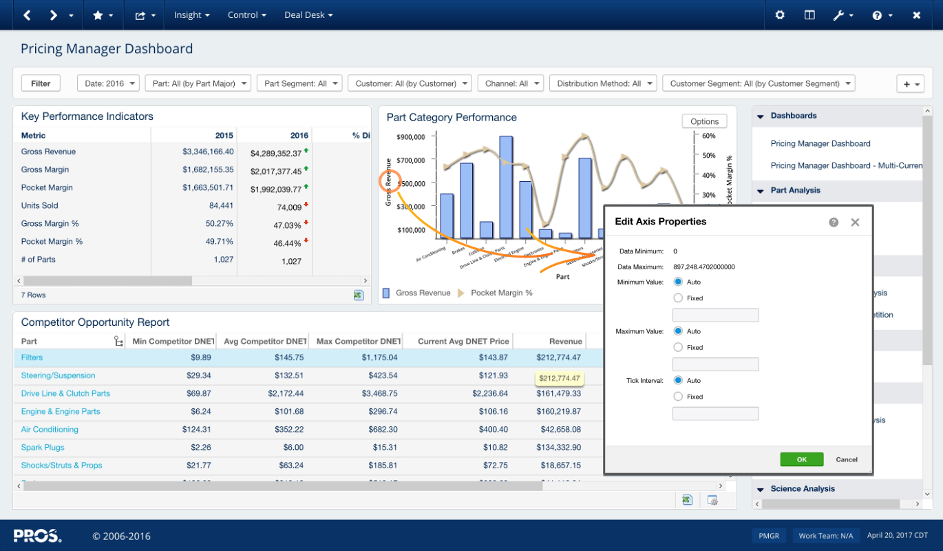
Insights is an analytics tool that enables Pricing teams to uncover drivers behind margin, revenue, and other essential metrics through a configurable data model and charts.

PROS Holdings
Lead Designer
2019
Insights is an analytics tool that enables Pricing teams to uncover drivers behind margin, revenue, and other essential metrics through a configurable data model and charts.
In 2020, all the top browsers ended support for Adobe Flash. Two years before this deadline, PROS embarked on an ambitious initiative to rewrite our flagship product based on Adobe flash to a new React-based front-end.
As the design lead for this high-profile initiative, I overhauled and helped ship a brand new design that cemented PROS as the leader in this category of Enterprise Price Management tools.
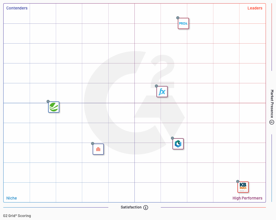
Top pricing software providers for the Enterprise market segment as per G2 Crowd.
One of the projects I worked on under this initiative was Insights. This decade-old analytics tool was on the verge of becoming obsolete as a new wave of BI tools and competitors appeared in the market. I led the design for this project and modernized it to be useful, easier, and delightful to use.
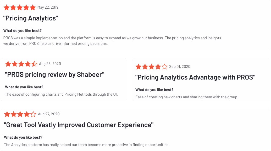
Customer reviews of the new Insights experience from G2 Crowd.
Here's the process I used to modernize this highly functional tool.
I began the design process by deeply understanding the problem space from multiple perspectives.
As a first step, I thoroughly evaluated the existing interface. From this evaluation, I made the following observations:
After a deep dive into the existing interface, I wanted to understand the problem from the business perspective. I interviewed a few of our key sales and implementation consultants (IC) to learn how we pitched and implemented our products. From these sessions, I discovered that often ICs did not have enough time to implement charts as required by our customers. And we were losing deals due to our outdated UI.
User describing her day-to-day workflow.
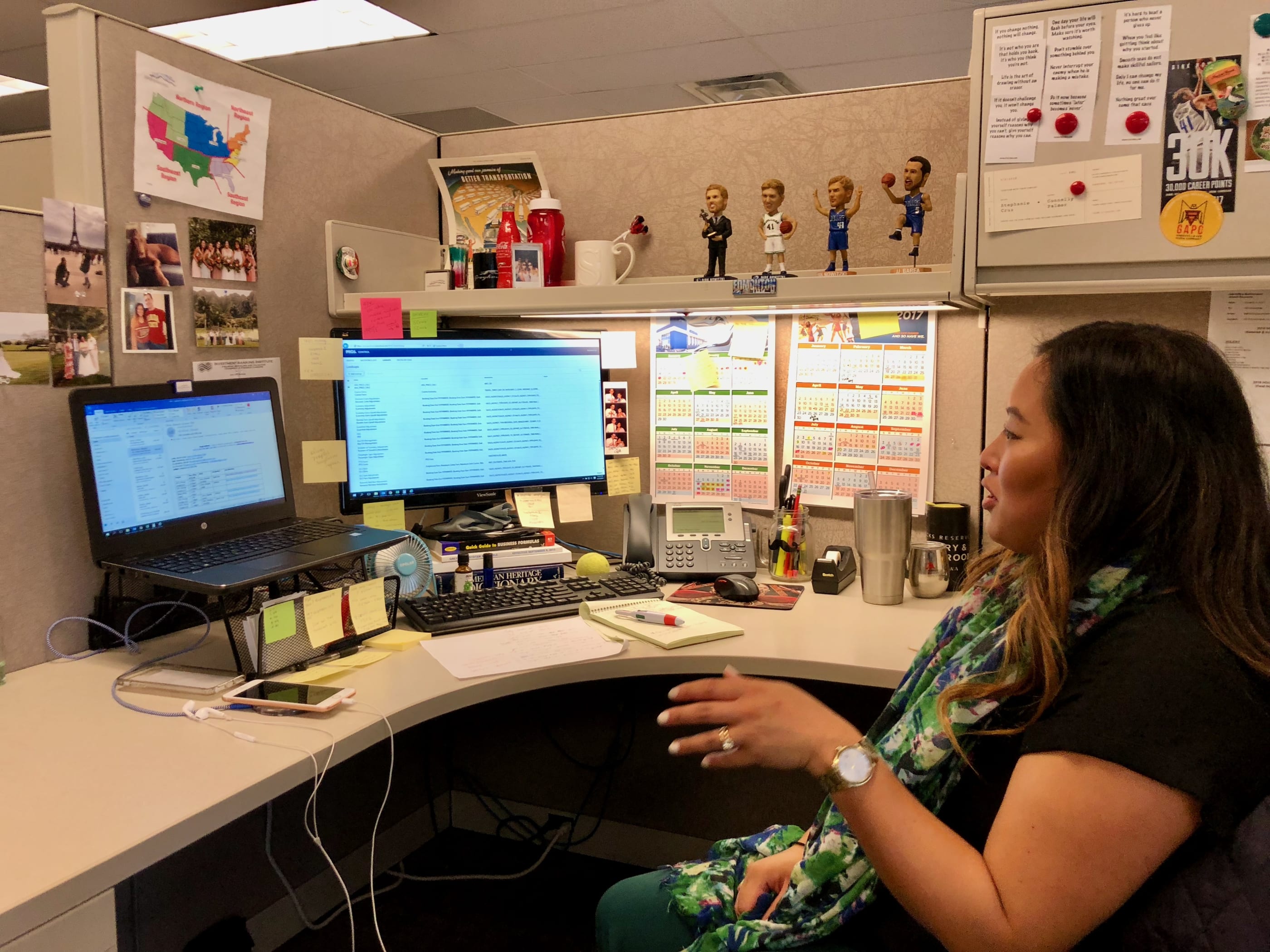
Next, I followed up with customer sessions to learn how our users utilized the analytics capabilities. I also visited our customers in person to understand their goals, tools, pain points, and how they used our product to get their work done. Seeing our users in person and learning how they used our tool daily was a game-changer and crucial to the new design's success.
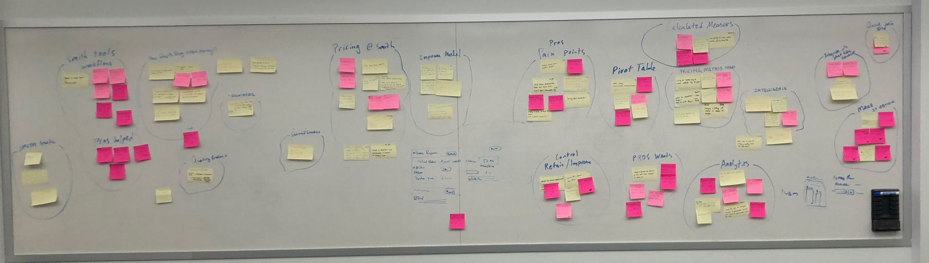
Affinity mapping qualitative findings to find themes.
The research confirmed my initial findings that basic tasks like creating and deleting required too many steps and caused confusion.
I don't know how to delete them (charts). Like once they are created are they there for life?
― Business analyst
Users were frustrated that they couldn't find a chart they had just created due to the complex underlying model.
After consolidating the findings and understanding our customer needs, I began identifying design principles to help guide our redesign.
Design Principles are a set of considerations that form the basis of any good product. They help guide the team towards making appropriate decisions. As a first step in the redesign process, I set up a session with our Product Manager and Developers. Together, we decided on three principles to help us guide our decision-making.
After identifying the design principles, we started brainstorming the key workflows. The goal of this exercise was to reduce as many steps as possible for our target persona, Carol.
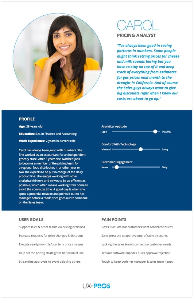
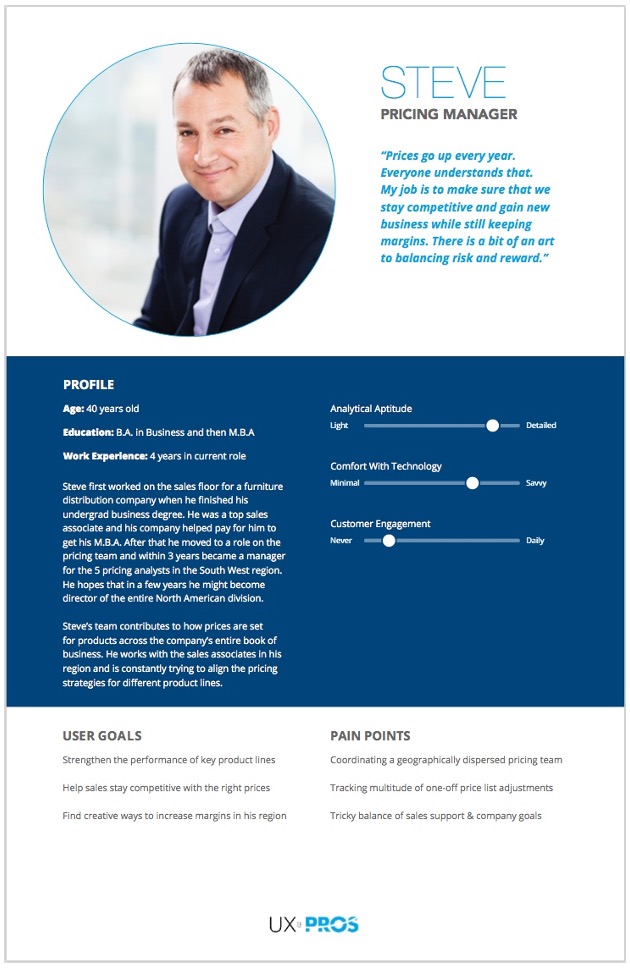
Key Pricing Personas.
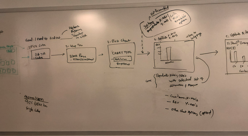
Workflow to create a new chart.
Later, I documented all the essential workflows to help inform my sketching process.
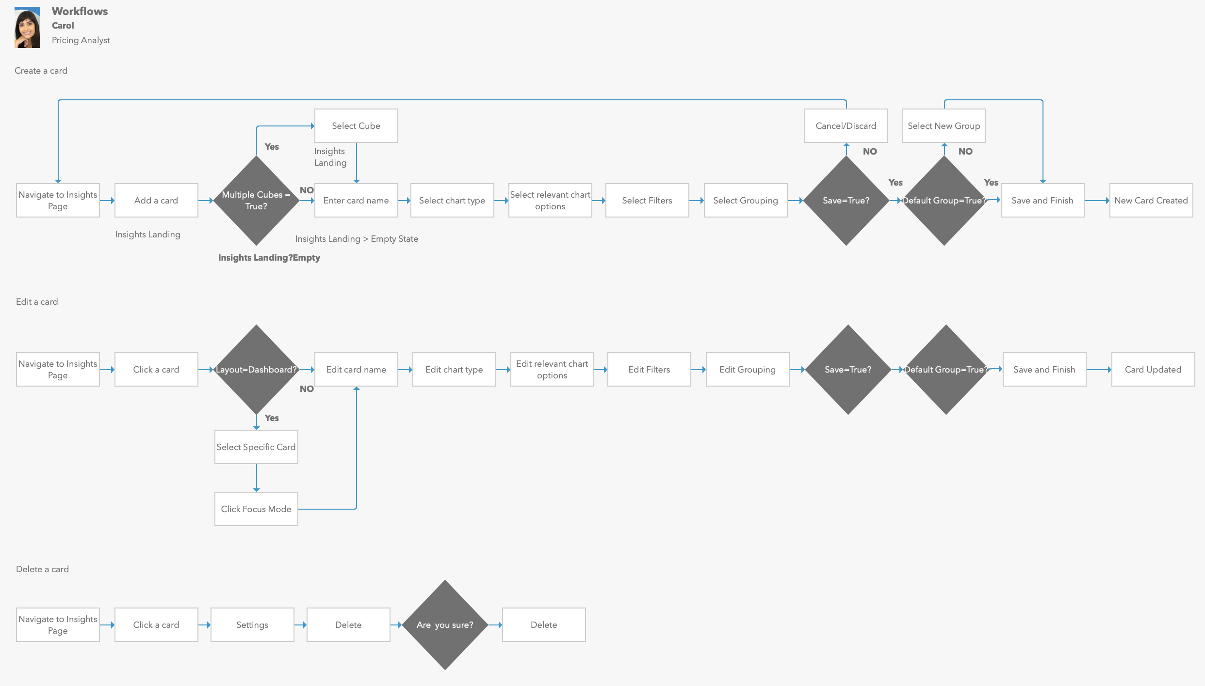
Mapping the create, edit, delete and duplicate workflows.
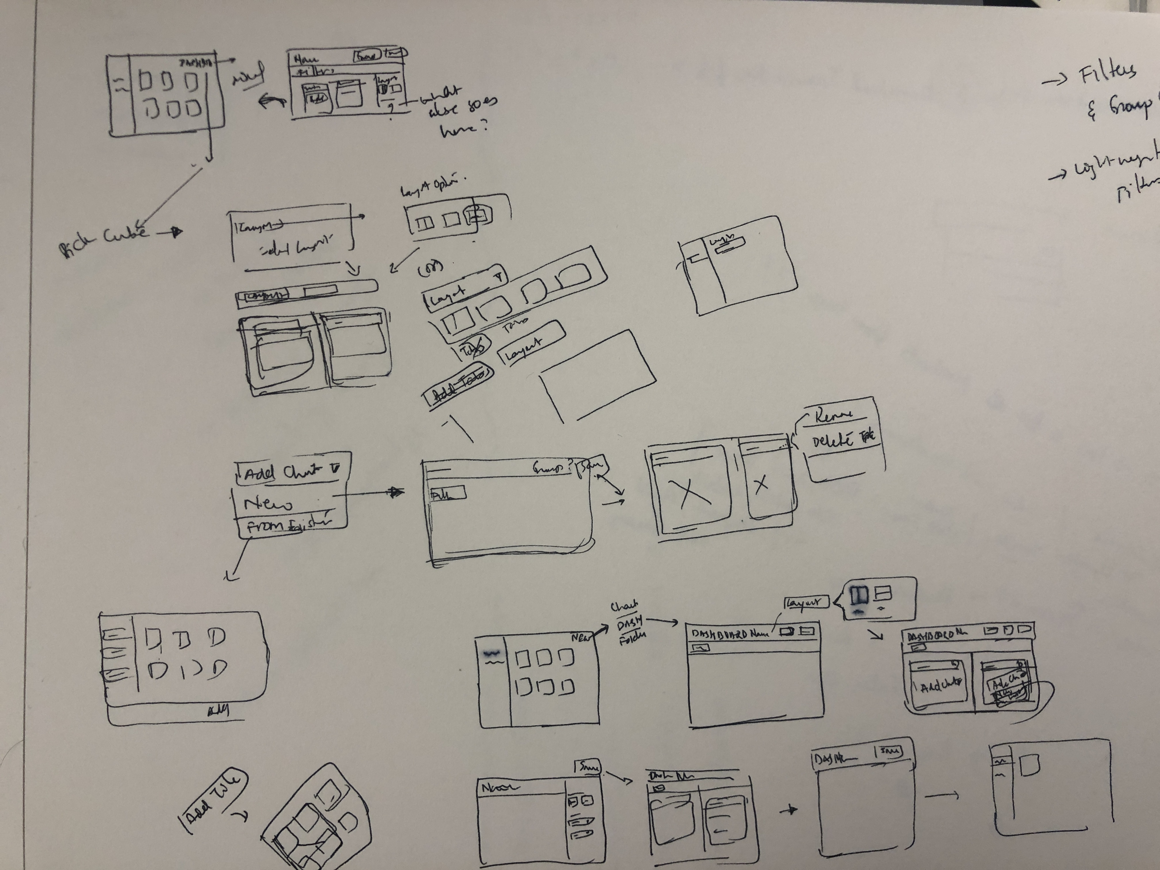
After identifying the workflows, I began sketching out the UI to accomplish the task. After iterating on various ideas, I began converging based on feedback from the Dev team and the Product Manager, specifically around feasibility and reusability.
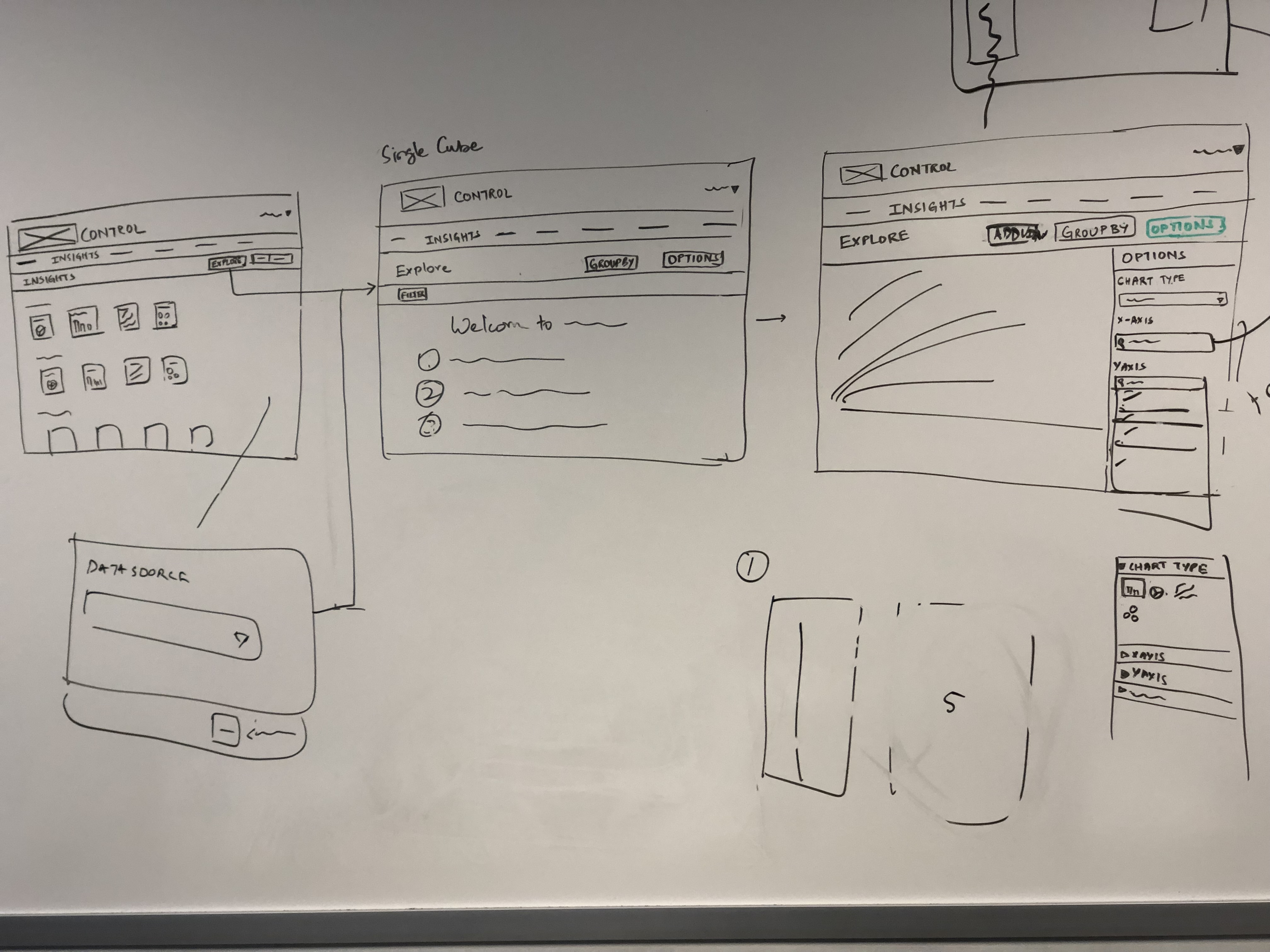
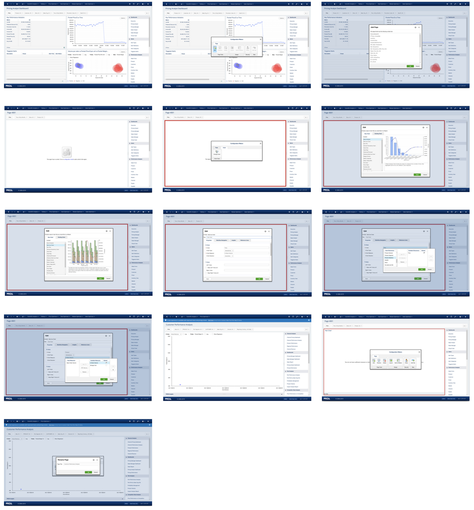
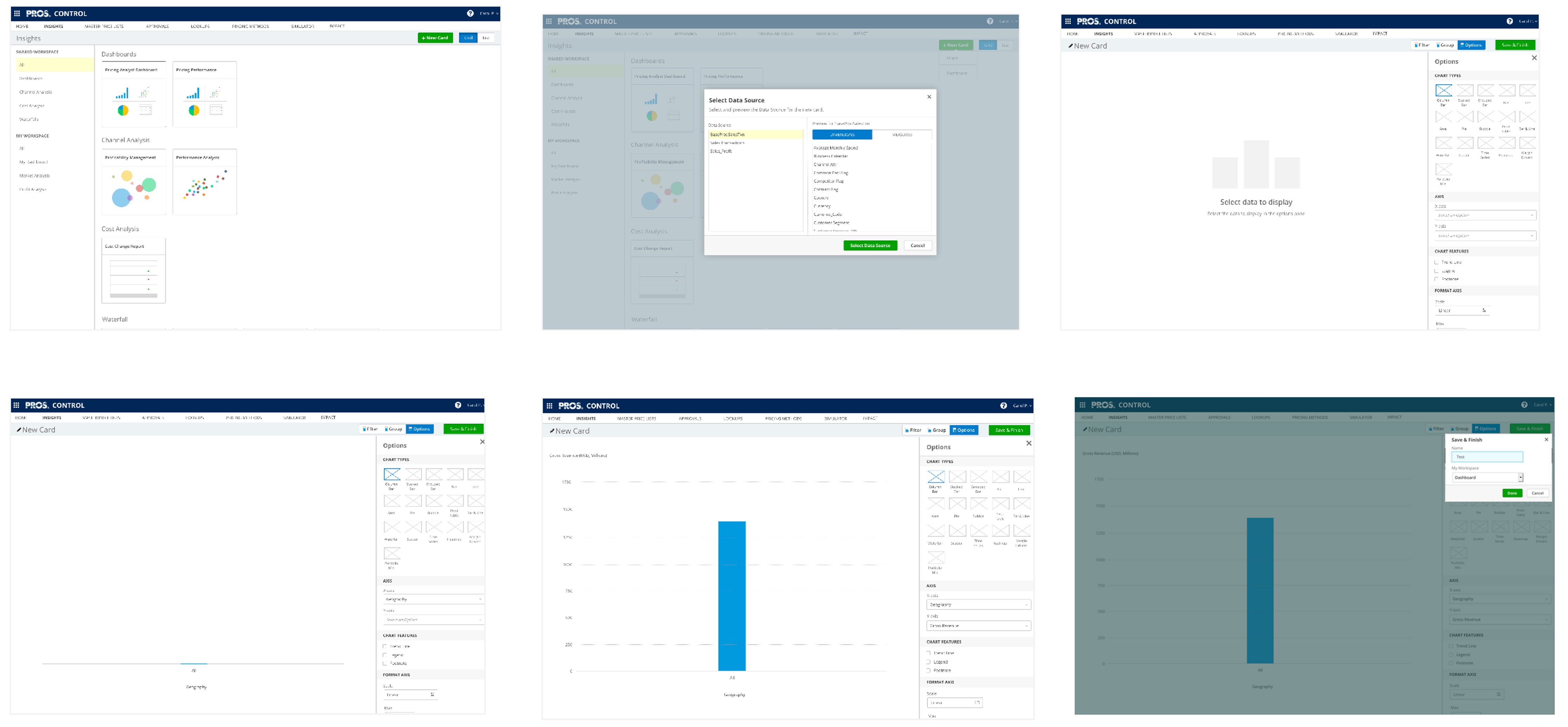
After confirming the direction, I began prototyping the end-to-end experience.
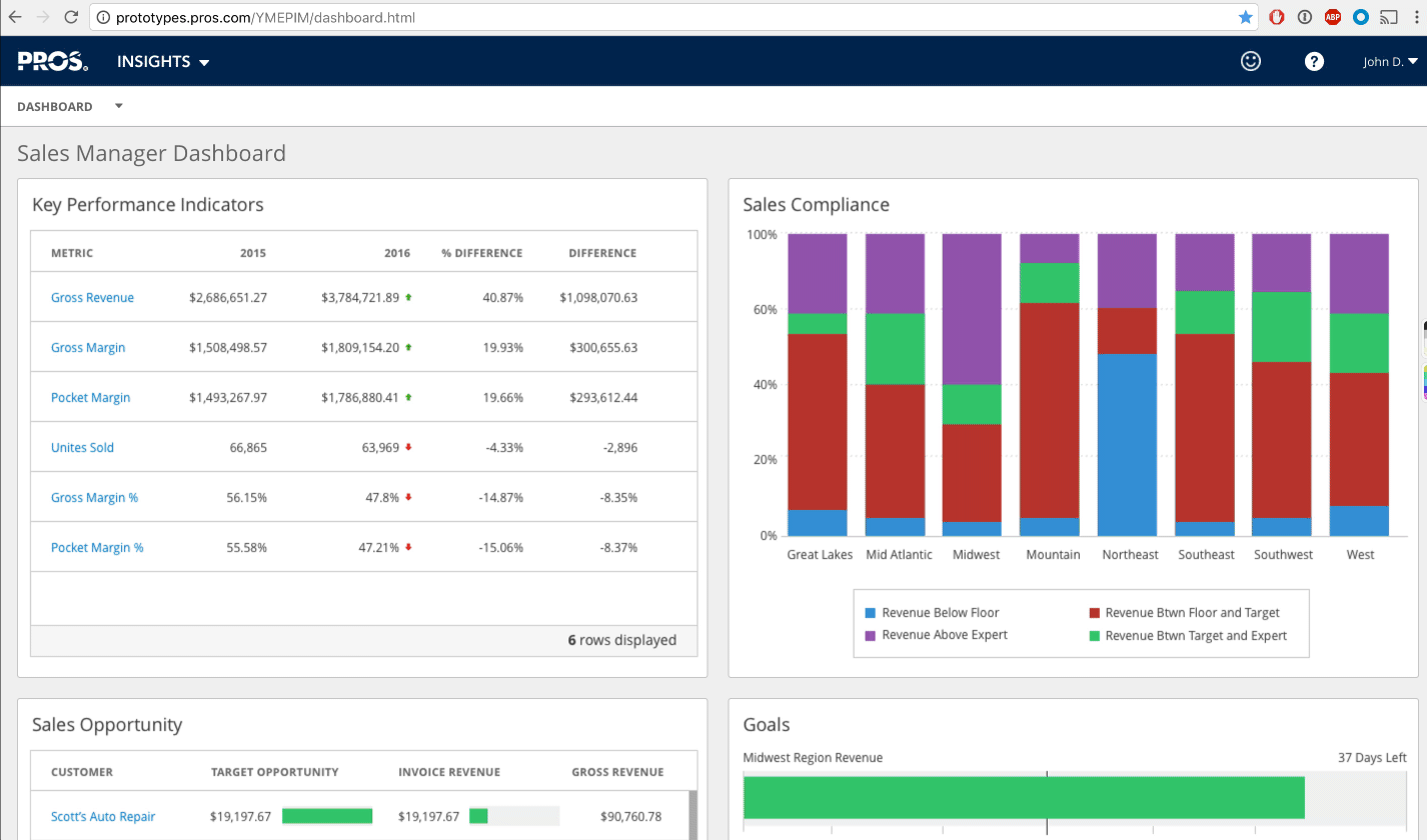
Prototyping is one of my favorite parts of the design process. I began by prototyping the read-only experience. As part of this, I explored new design patterns, such as the sidebar for consolidating the chart options and zooming into a chart from a dashboard.
Next, I prototyped the key workflows to create, edit, and delete a chart.
Prototype showing the process of setting up a chart.
I then set up with five subject matter experts from our Implementation team to get feedback on the design and the workflow.
Overall feedback from these sessions was that the new design was considerably better than the existing Classic experience. However, users were confused with the some of the new terminology.
After updating the prototype based on internal feedback, we set up sessions with our customers (15 users).
Our lead researcher interviewing a participant.
So I can create a chart and set up the filters and just send them (Sales Reps) a bookmark? That is so cool!
― Global Pricing Product Manager
Most of the users who participated were excited to see the direction. A few users were curious to see how they could create dashboards and wanted to know when this would be ready with the flash deadline looming.
Based on the feedback, I updated the terminology and the prototype to incorporate the dashboard worklflow.
Prototype showing how to set up a dashboard.
After finishing the prototype, I worked with our UI Design team to finalize the visual details. One of the tasks I worked on was the icons to select the different chart types.
Icons to select different charts.
I also contributed content to our Design System, providing guidelines on selecting charts.
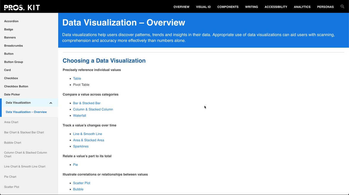
Guidelines to select chart.
As the development started, I set up bi-weekly reviews with the UI developers to identify and triage potential issues and documented them in JIRA. I also participated in backlog grooming to prioritize fixing issues.
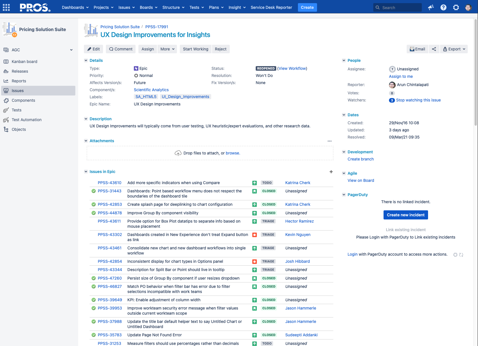
Epic to track UX defects.
As time progressed and we got closer to our deadline, I noticed our UX debt was substantial. To reduce this debt, I strategized with our Dev and Product Managers and implemented a bug bounty program.
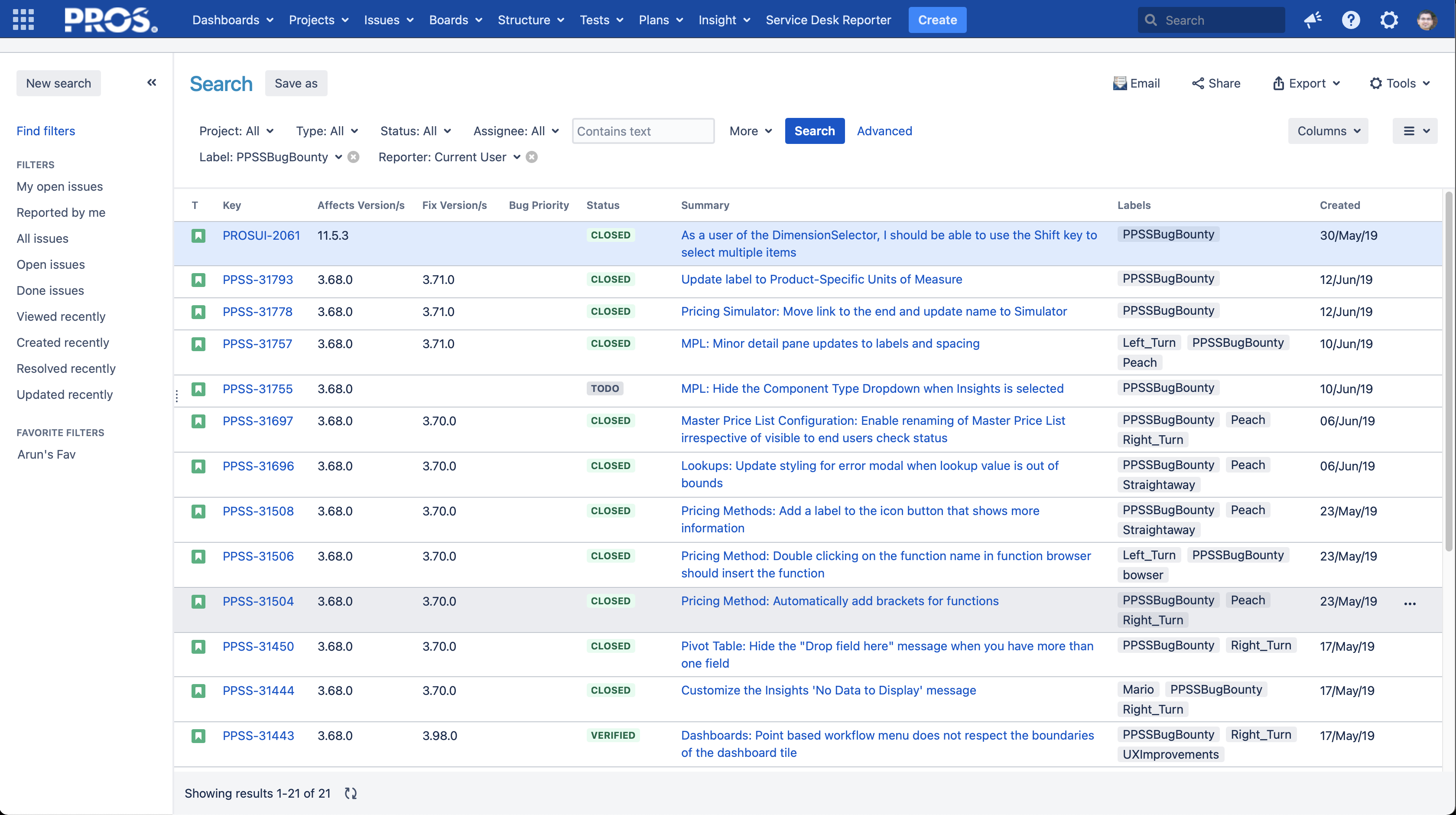
Issues reported by me for the Bug Bounty program.
In total, we fixed 36 out of 41 reported UX defects.
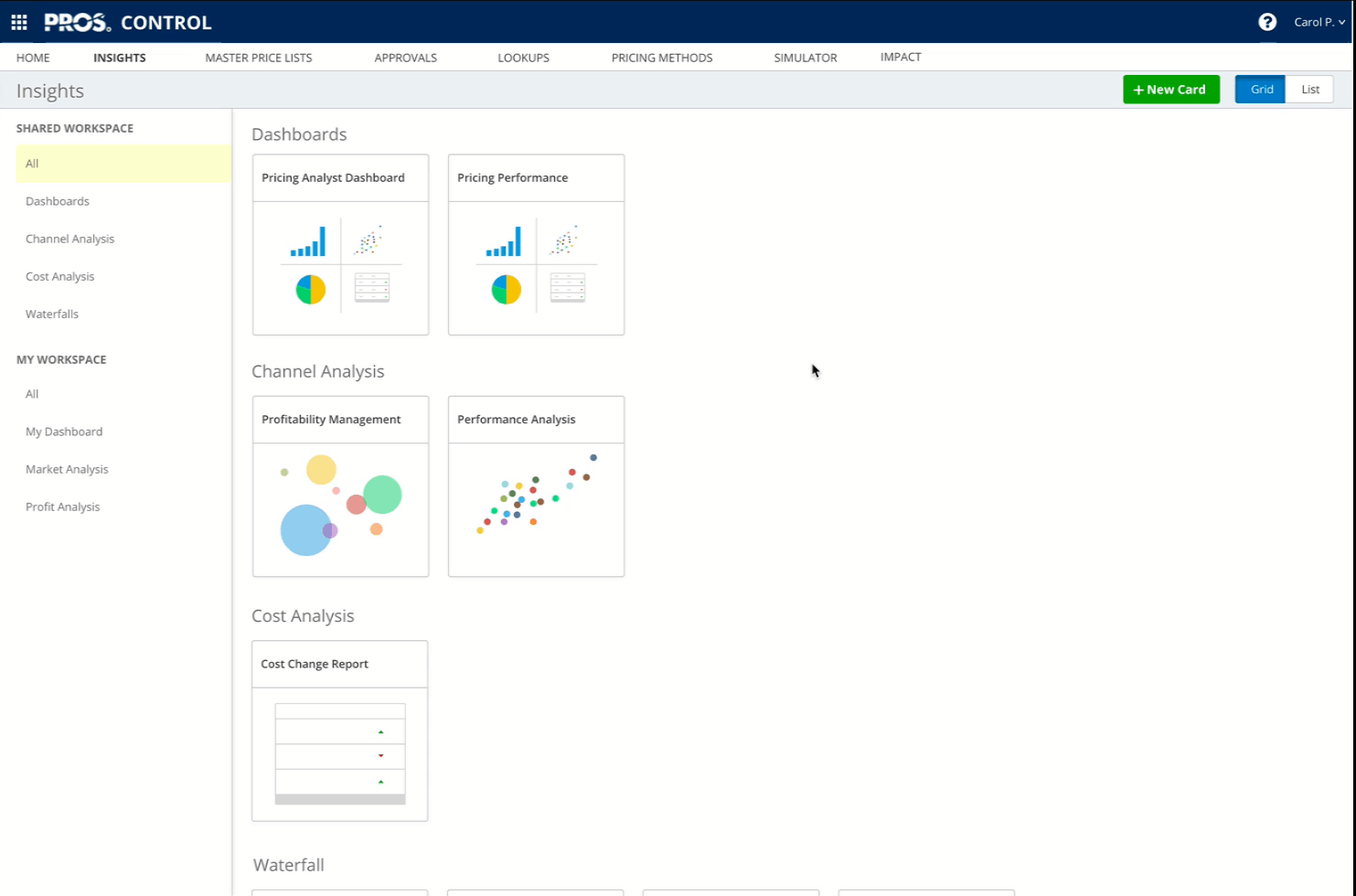
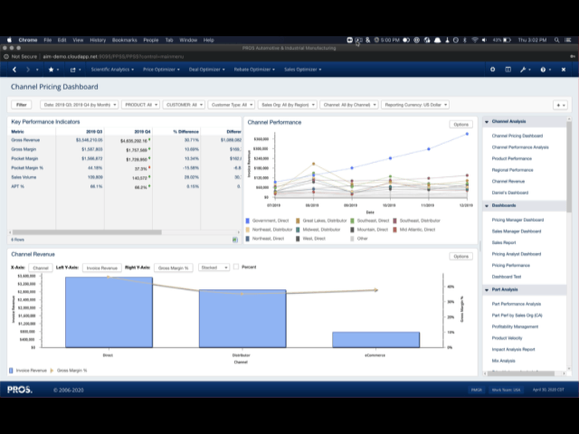
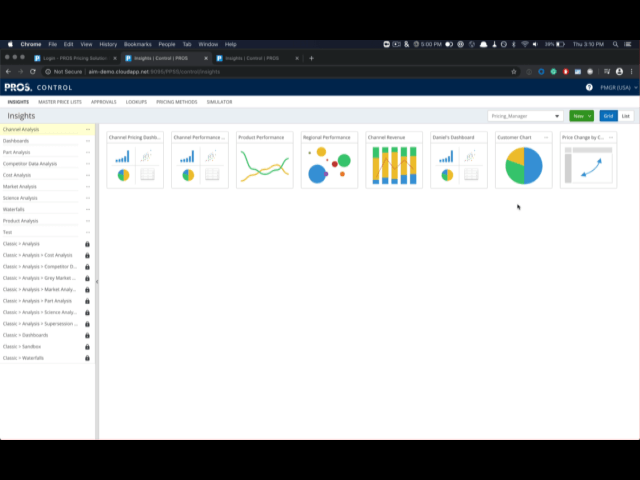
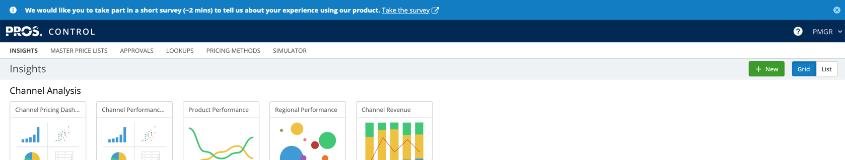
These were the final designs implemented by the development team.
Here are a few outcomes I achieved with the new design:
1 Min
23 Sec
24
Clicks
12
Clicks
I created a survey to compare the Classic experience and the new to get more objective data. Historically, gaining access to end users has always been a challenge. I worked around this challenge and launched a survey directly from the application with help from the Dev team.
I also helped standardize the UMUX Lite questionnaire across all our products to benchmark our products' User Experience making it more accessible with less fatigue.
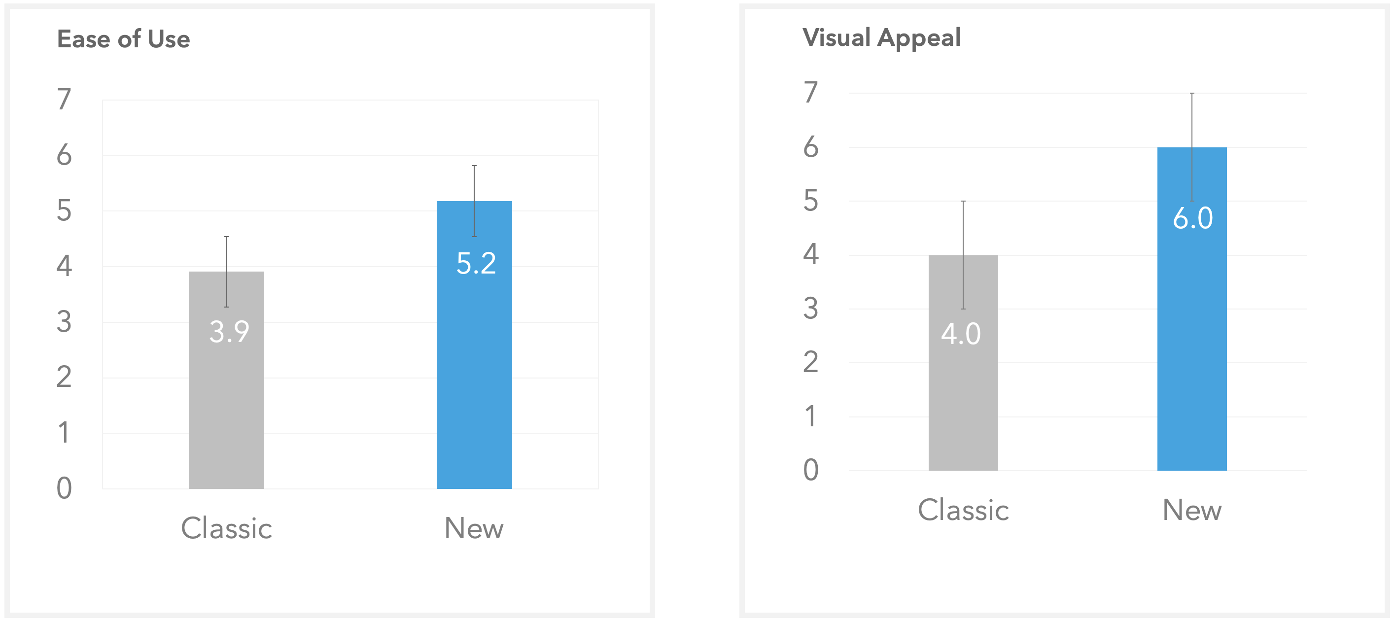
Results from the benchmarking survey. Based on average customer ratings. N= 29 (classic) vs. 10 (new experience). 1: Strongly Disagree - 7:Strongly Agree.
Results from the survey indicated that users who used the New experience found it easier to use over Classic. We also found customers rated our new visual styling better over Classic.
Note, there was no change for meets needs between both the experiences.
Recently, PROS was recognized as a leader by IDC in the B2B Price Optimization and Management space. The following was cited as one of the strengths:
Ease of use– Customers highly rated how easy PROS was to understand, use and train their staff.
IDC MarketScape: Worldwide Retail Price Optimization Solutions 2021–2022 Vendor Assessment
Team: Thomas Patella, Daniel Rutledge, Kevin Nguyen, Sharmila Xavier, Jason Hammerle, Chris Fick, Julian Mondragon, Sudeepti Addanki, Yiran Zhu, and more.